


A large share of revenue in ecommerce does not come from what people search for. It comes from what they discover along the way.
Various studies suggest that up to 40% of online spending is attributed to purchases that were not part of the original intent. That number shifts by category, but the principle stays stable.
Understanding how to sell products people aren’t looking for starts with an idea that desire can appear before intent. When the environment is shaped in the right way, people do not need to search. They notice, imagine, and decide.
Here’s how that works in practice.
1. Place Products Where the Eye Already Goes
Visibility is the first condition. A product cannot be chosen if it is hidden behind menus or buried deep in a catalog.
In physical stores, this has been studied for decades. Items placed at eye level sell more. Products near checkout areas perform above average. The same logic applies in ecommerce, though the space looks different.
Online, the “eye-level shelf” becomes:
- Homepage features and rotating banners
- Product recommendation sections
- Social media feeds and short-form content
- Post-purchase pages
The product does not need to match a search query. It only needs to stand out long enough to be noticed.
For example, a store that sells kitchen tools might place a garlic press on a product page for knives. The customer came for one thing, but the second item sits in a place where attention already exists. No extra effort is required.
2. Show the Product Inside a Real Situation
A product in isolation asks the viewer to do too much work. It requires imagination. It asks, “Where would this fit in my life?”
A product in context answers that question immediately.
Instead of a plain image of a chair, show a small reading corner with soft light and a book on the seat. Instead of a simple photo of a skincare product, show a morning routine.
When people see a product in use, they can easily picture ownership. This shortens the path to a decision.
 3. Start With Emotion, Let Logic Follow
Very few purchases begin with a detailed comparison of features. They begin with a small internal reaction.
Curiosity, aspiration, a sense of improvement. These are subtle, but they guide the next step. Technical details still have value, though they rarely lead.
A fashion store introduces a new jacket. One version of the ad lists fabric and sizing first. Another shows a short scene of someone stepping outside on a cold morning, putting it on, and heading out with ease. The second version draws more interest.
Emotion does not mean exaggeration, but selecting the right entry point.
Some effective triggers:
- A sense of upgrade in daily life
- A moment of comfort or convenience
- A visual contrast between before and after
After that first reaction, details can follow. At that stage, the customer is already engaged.
4. Make the Path to Purchase Simple
If the page takes too long to load or the checkout requires multiple steps, initial interest can disappear.
Data shows that the average cart abandonment rate remains close to 70%. A large portion of that comes from complicated checkout processes and unexpected steps.
Small adjustments can make a difference:
- Clear pricing without surprises
- Minimal steps from product page to purchase
- Fast-loading pages
- Saved payment options
This part is less visible than content or design, though it shapes outcomes in a direct way. When the path is simple, decisions happen with less hesitation.
5. Turn Browsing Into Discovery
Search is direct; discovery is open-ended.
When someone searches for a product, the goal is clear. When someone browses, the goal is not fixed. This is where new products can enter.
Recommendation systems and curated collections play a role here.
“You might also like” sections are common, though their impact depends on relevance. A more thoughtful selection can create a sense of exploration.
For example, an online store selling home decor creates a collection around “slow evenings.” It includes candles, soft lighting, and small accessories. None of these items were requested. Together, they form a coherent idea.
This can be extended into:
- Seasonal collections
- Mood-based groupings
- Themed product sets
In this way, the store behaves less like a catalog and more like a guide.
6. Use Timing and Repetition to Strengthen Interest
 When people see the same product more than once, it starts to feel known. This is a well-documented effect in customer behavior research: familiar items are easier to choose.
Timing i salso important. A product shown during a casual scrolling meets less resistance than one shown during a focused task.
Consider this sequence:
- A person sees a product on social media
- Later, the same product appears on the store’s homepage
- A reminder shows up in an email or ad
Each step is light, no pressure is applied.
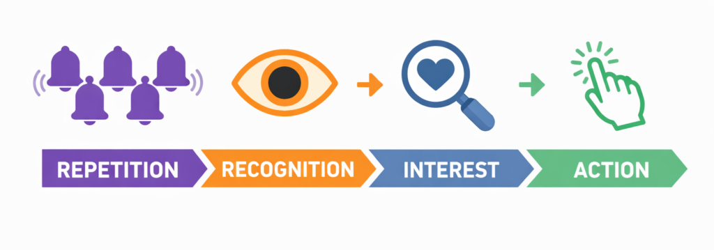
The repetition shapes recognition, recognition turn into interest, interest turn into action.
7. Give a Clear Reason to Say Yes
Even spontaneous purchases include a brief internal check. A simple justification can close that gap.
This does not need to be complex. Examples include:
- A limited-time offer
- A clear value comparison
- Strong reviews or ratings
Social proof has a strong effect here. A product with many positive reviews reduces hesitation. It answers questions before they are asked. A small discount can create a sense of timing.
The key is clarity. The customer should not search for a reason: it should be visible.
How to Sell Products People Aren’t Looking For in Practice
As you’ve seen, it’s not rocket science. The whole process moves through a few stages:
• visibility
• context
• emotion
• ease
• justification
Executing this consistently is the real challenge for ecommerce businesses. Content needs to be created, adapted, and published on a regular basis. Visuals need to show products in use, not just in isolation. Campaigns need variation, not repetition of the same format.
Stryng is a platform built to solve these challenges. It starts with the store itself: a simple URL provides enough information to generate visuals, short videos, and posts that place products into real situations.
The system handles everything from creation to publishing on social media. The only thing the store owner needs to do is approve and adjust if necessary.
The result is a steady presence: products appear in feeds, in context, and at the right moments. This kind of setup helps maintain the conditions that lead to discovery.

