When a campaign is on the line, small changes to layout, copy, or buttons can cost hours of rework.
An email mockup gives everyone a clear view of the message before any code is written.
Marketing can compare story flows. Copywriters see if their paragraphs read naturally. Design checks how hero, offer, CTA, and proof work on a phone screen.
This guide explains what an email mockup actually is, what it usually includes, how it fits from concept to send and how it helps campaigns run smoothly.
What Is An Email Mockup
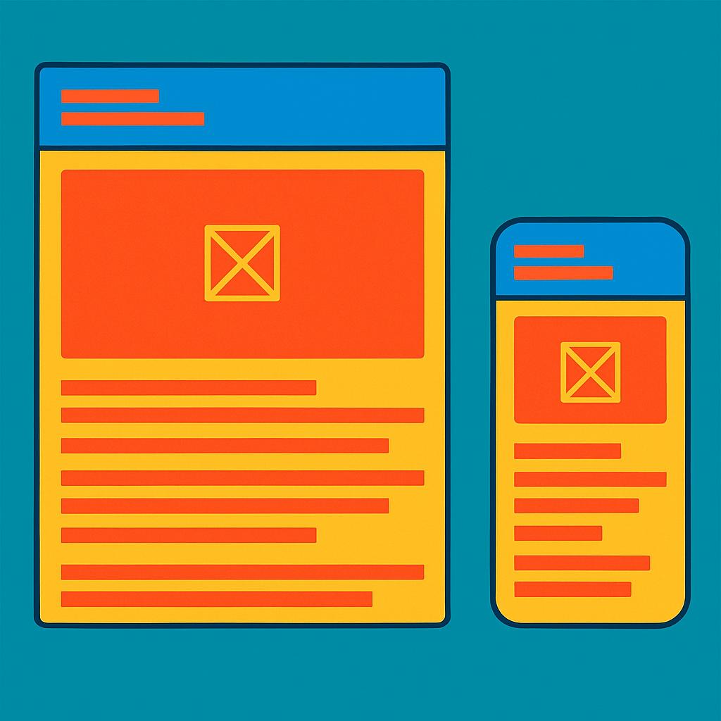
An email mockup is a visual draft of an email. It shows layout, content blocks, images, copy, and buttons as they should appear to a subscriber.
It is not code: it is a picture or design file that represents the intended result.
Marketers usually use an “email wireframe” first to shape rough structure. The mockup then adds real copy, brand colors, and imagery.
Some teams also use an “email prototype” with basic interactions, like hover states or animated GIFs, to convey motion.
Three things define a solid mockup:
- It is accurate to the brand system. Colors, spacing, and typography reflect established standards.
- It is practical for email HTML. Modules, widths, and image usage are designed to be compatible with different email clients.
- It is easy to comment on. Stakeholders can mark up sections, request changes, and resolve threads.
Because it is visual, a mockup makes decisions faster than a long document could. People scan it and react in minutes.
Why Email Mockup Exists
Reducing Rework
Rework in email campaigns often comes from late changes to copy or layout. A mockup gets those changes out early, when edits are cheap and quick.
Teams that formalize a mockup stage tend to see fewer code reworks and fewer emergency fixes in the Email Service Provider (ESP). Many of the problems with email marketing today improve when stakeholders react to a picture instead of a text outline.
A brief case example: a retail brand moved from direct-to-HTML to a mockup-first flow. After two months, its average production time dropped by 25 percent. Ticket backlogs fell. Designers and developers spent less time in last-minute revisions.
Early Team Agreement
Marketing, design, CRM, analytics, and legal need a shared view of the campaign. A mockup gives that view.
Useful agreement checks include:
- Purpose: sale, announcement, onboarding, or reengagement
- Primary KPI: click-through, product views, or account actions
- Segmentation notes: audience, dynamic content, or exclusions
- Edge cases: no image mode, long names, price ranges, or copy overflow
Agreement at this stage avoids long debate later.
Letting Everyone See The Same Thing
Words often create different mental pictures. A visual mockup shows the exact hierarchy, spacing, and tone. Non-designers can respond to what they see, not what they imagine.
This helps in three ways:
- Less ambiguity. Decisions are based on the same artifact.
- Fewer Slack chains. Comments sit in one place.
- Faster signoff. A shared, visible record lowers approval friction.
Mockups also help executive reviewers. They may not read long briefs, but they react fast to a clear, page-like preview.
Where Email Mockup Lives In The Workflow
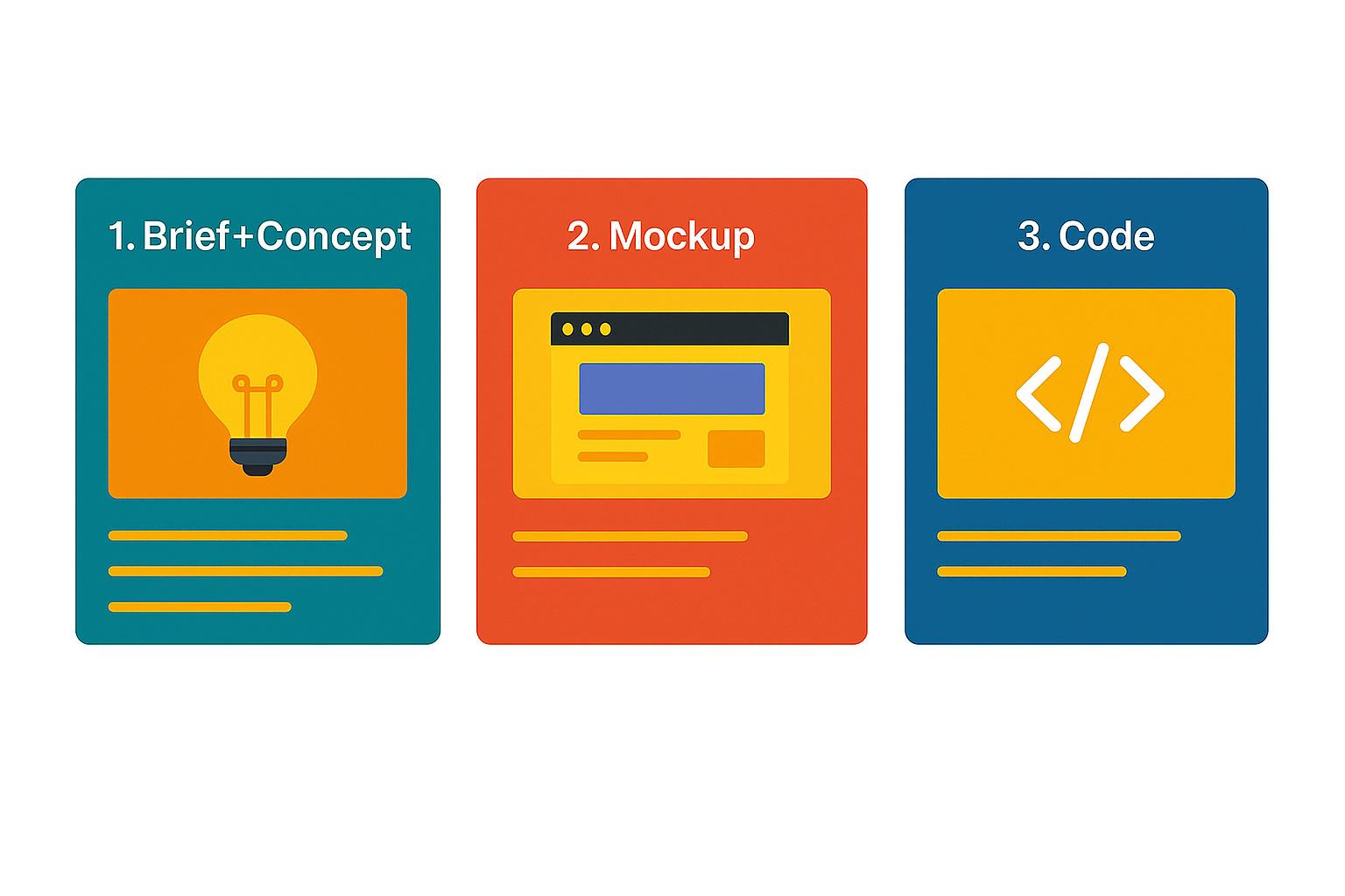
After Brief And Concept
A brief defines the goal, audience, and offer. A concept turns that into a message strategy. The mockup translates the concept into a concrete design.
A simple sequence:
- Align on the brief and core message.
- Sketch a quick email wireframe that supports the goal.
- Produce the mockup with real copy and images.
- Collect feedback and finalize the design.
The mockup also cues supporting pieces like SMS or social retargeting. An email layout can inform timing and voice for ecommerce SMS marketing to keep the story consistent.
Before HTML Build
Mockups sit right before code. They guide development choices, such as single-column vs hybrid layouts or image slicing vs live text.
Typical pre-build checklist:
- Confirm final copy length and button labels.
- Verify image dimensions and file sizes.
- Lock color tokens and spacing scale.
- Note mobile-specific adjustments like stacked modules.
Faster iteration at this stage reduces overall production hours.
| Stryng is an AI tool that helps you create, edit, and publish marketing content. Work with text and visuals together in one place, adjusting copy and adding images without switching tools. It’s great for ecommerce teams looking for smoother content creation. Try it for free. |
Before Legal And QA
Legal reviews go faster with a static design. Disclaimers, price displays, and promo windows are visible.
QA planning also benefits because testers can map checks directly to what they see in the mockup.
Key items to mark:
- Required legal lines and their placement
- State or country variations
- Link destinations and tracking needs
- Accessible names for buttons and images
What An Email Mockup Usually Contains
Layout And Spacing
A mockup defines the grid.
Common email widths are 600 to 700 pixels, with a single or modular column. Spacing uses consistent tokens so sections feel related.
Consistency is important, since email HTML relies on tables and inline styles.
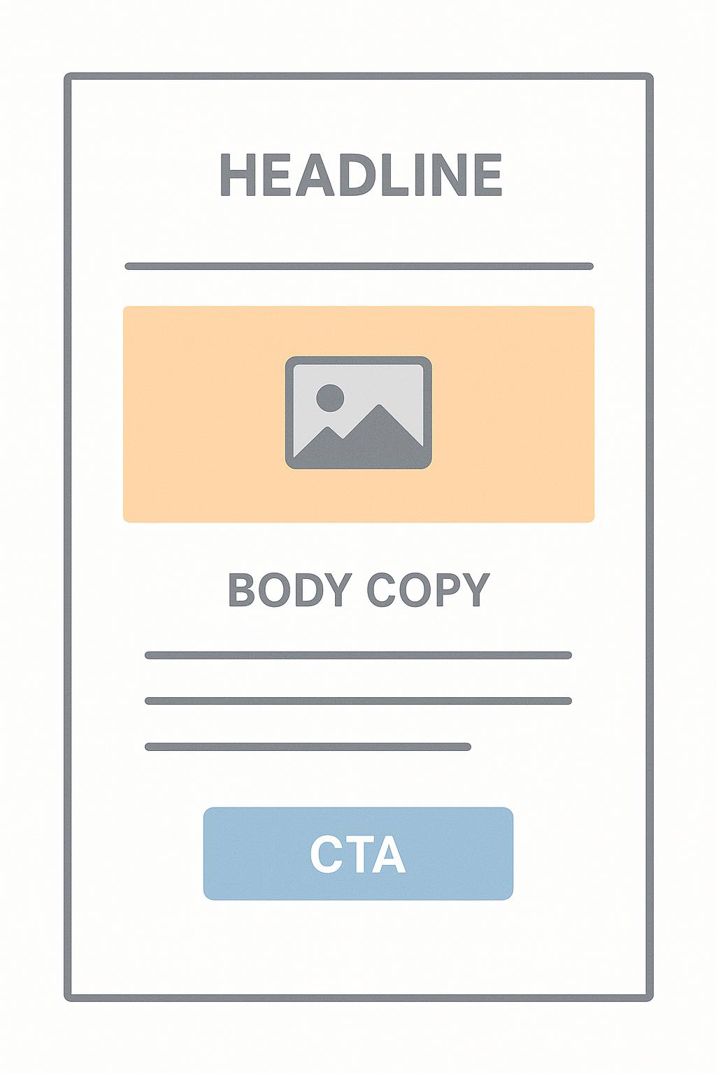
Copy And CTA Placement
Copy should be concise and action oriented. The mockup shows headline, subhead, body, CTAs, and supportive microcopy like labels or disclaimers.
Two high-impact tips:
- Place the primary CTA near the hero content with enough whitespace to stand out.
- Use descriptive labels, not generic “Learn more.” The button should say the value, such as “See fall styles” or “Track my order.”
Practical guides like top 10 CTA mistakes and writing effective headlines help shape stronger copy, which the mockup makes visible for quick feedback.
Platform Safe Typography
Email clients vary in support for web fonts. Many fall back to system fonts.
A mockup should show the actual fallback stack and how it affects line breaks, spacing, and wraps.
Designers typically add these elements:
- Primary web font and fallback stack
- Live examples of H1, H2, body, and captions using fallbacks
- Mobile adjustments for size and line height
To check feasibility, teams rely on current tables for email client CSS support.
Visual Hierarchy
Hierarchy directs attention. Headlines, color, size, and spacing guide the eye to the right action. The mockup should make the hierarchy obvious within the first screen.
Practical pointers:
- One primary action per screen height
- Clear contrast between text and background
- Consistent heading ladders for scanning
Typical Design File Types
Design teams choose the tool that suits their process, collaboration style, and budget. Each has strengths for comments, sharing, and developer handoff.
Figma
Figma supports real-time collaboration and commenting. Multiple reviewers can annotate the same mockup. Components and auto layout speed up reusable modules like product cards or footers.
Developers benefit from inspect features that expose measurements, color values, and export assets. Marketing managers appreciate share links that do not require software installs. Plugins can generate content or simulate realistic data.
Potential risks include version creep if naming rules are loose.
Sketch
Sketch is strong for symbol libraries and component-driven systems. Teams that prefer macOS and native performance often favor it. Handoff works well through third-party tools or exports.
It shines when designers maintain a robust design system with consistent tokens and symbols.
Remote reviewers may need extra steps to comment. Many teams export to a web viewer for feedback and signoff to keep discussions centralized.
Presentation Or PDF
Some teams prefer slide decks or PDFs for stakeholders who do not use design tools. This approach is simple and portable.
It works best for single sends, one-off announcements, or quick memos. Comments often happen in email or chat, so version control becomes important. PDFs also remove inspect features, so developers rely on specs included on the page.
What Happens After The Mockup Is Approved
Engineering Build
Developers turn the mockup into HTML that works across clients like Gmail, Apple Mail, and Outlook.
Email HTML relies on nested tables, inline styles, and careful image handling. Many teams also use template engines to swap in content.
A practical sequence:
- Set up the base template with doctype, meta tags, and container tables.
- Code modules that map 1:1 to the mockup.
- Inline CSS and test responsive behavior.
- Add alt text, link tracking, and fallbacks for images or web fonts.
Frameworks like MJML documentation can speed builds and keep code maintainable.
For teams with large catalogs, programmatic content and content automation reduce manual work without losing alignment to the approved mockup.
Test Pass
Testing confirms the coded email matches the design in major clients and devices. It also checks accessibility and deliverability basics.
Key checks include:
- Visual diffs across popular clients and dark mode
- Link accuracy and UTM parameters
- Alt text, semantic order, and focus states
- Load performance and image weight

Send In ESP
The ESP stage turns code into a campaign.
Teams set audience, schedule, and tracking.
They assign templates, create variants, and add personalization.
Modern ESPs support dynamic content and triggered sends. Reviewers confirm that fallback content looks acceptable.
Final Thoughts
Email mockups are a simple way to align teams and cut rework. They turn abstract ideas into a clear picture that decision makers can approve with confidence.
With the right file setup, thoughtful typography, and a firm grip on hierarchy, mockups make production smoother and outcomes more predictable.
They also set the stage for reliable testing and healthy deliverability. As channels multiply, that clarity keeps messages on brand and on schedule.
Frequently Asked Questions
Q: Is an email mockup the same as a wireframe?
A: No. A wireframe is a rough structure with boxes and placeholders. A mockup uses real copy, type, and imagery. It shows how the message should look and read.
Q: How detailed should a mockup be?
A: Detailed enough for a developer to code without guessing, and for a stakeholder to approve without caveats. Include spacing, type styles, mobile behavior, and link destinations. Avoid ambiguous notes.
Q: Who owns the mockup in a team?
A: Design usually creates it, but marketing owns the message. Engineering advises on feasibility. Legal verifies required language. Ownership is shared, with one DRI for final signoff.
Q: How long does a good mockup take to produce?
A: Simple promotional emails can be mocked in a few hours. Heavily personalized or modular newsletters may take a day or two. Time drops as component libraries mature.
Q: Does a mockup include subject line and preheader?
A: Yes, at least as a note near the top. They influence the first impression and should align with the hero message and CTA.
Q: What is the difference between a mockup and an email prototype?
A: A mockup is static. An email prototype may include simple interactions like hover states or GIFs to communicate motion. Prototypes help when animation or microinteractions are central to the concept.
Q: How does a mockup help with newsletter design?
A: It forces choices about hierarchy, spacing, and scannability before code. Readers benefit from consistent ladders of headlines and clear sections that match their goals.