Lifestyle products are the things people use every day, like coffee mugs, backpacks, or skincare kits. They fit into routines and make life easier.
Photographing these products requires more than showing what they look like. You need to show how they live in the world and how people interact with them.
This guide will walk you through planning, shooting, and editing lifestyle product photography so your images are clear and ready for any platform.
Planning Your Lifestyle Product Photography Shoot
A plan saves time on set and in post. You step in with a purpose and leave with a library of usable assets.
Define the Goal
Before you pick a lens, define success. Are you aiming for higher add-to-cart rates, social saves, or wholesale sell sheets?
Create a short plan:
- Write the core message in one line. Something like: “This bag keeps gym gear fresh on the commute.”
- Specify deliverables by channel. Think hero, detail, and in-use shots per SKU.
- List the must-show features. Zippers, texture, size reference, or original materials.
- Decide the mood. Clean studio kitchen, cozy morning desk, or trailhead parking lot.
- Set metrics. Click-through rate (CTR) on product detail page (PDP) image gallery, watch time on reels, or email click-through.
If you have an online store, Tie this plan back to your broader ecommerce content strategy. You move faster when the visual story and the marketing narrative align.
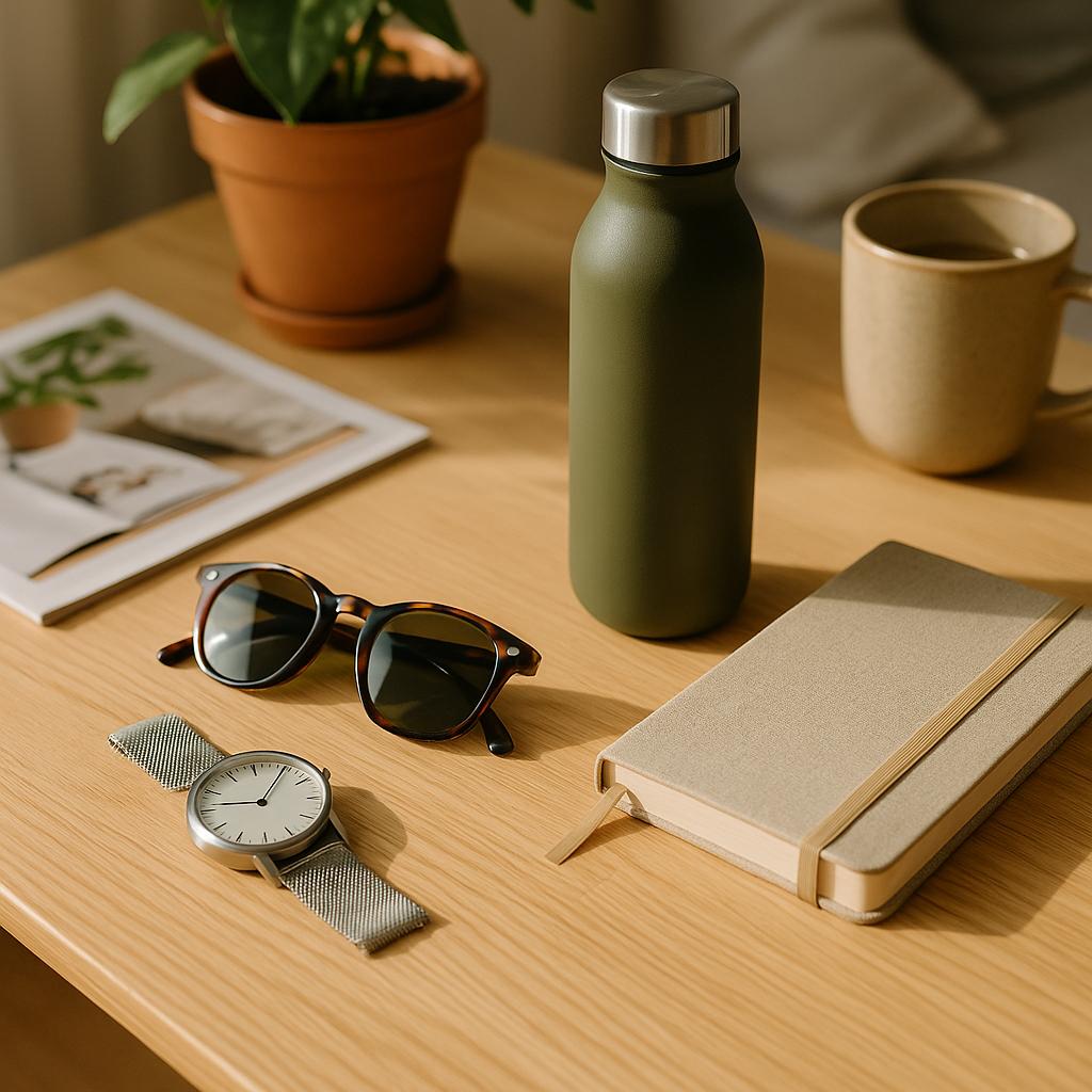
Choose the Right Context
Context should feel true to the product.
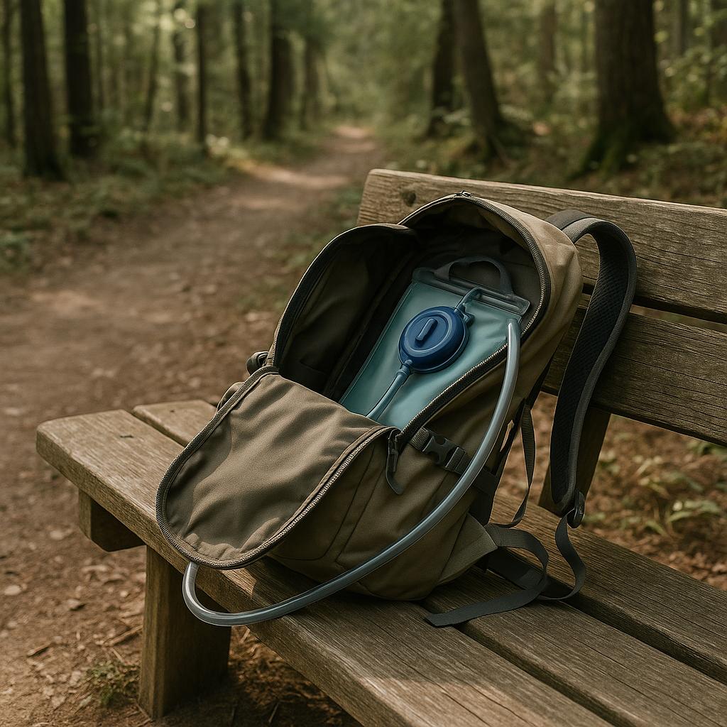
A premium chef’s knife belongs near a chopping board and fresh produce. A hydration pack makes sense on a trail, not in a formal dining room.
Use these cues:
- Place products where they are used. Kitchen, bathroom, garage, gym, or sidewalk.
- Pick surfaces that match the brand. Stone feels durable, wood feels warm, tile reads clean.
- Bring in scale anchors. A hand, a laptop, or a standard coffee cup.
- Avoid visual lies. Don’t show waterproof use if the product is only water-resistant.
Good context answers unasked questions. Where will I keep it, how big is it, and how will it look in my space?
Build a Moodboard for Reference
A moodboard is a visual reference panel. Basically, it’s a quick cheat sheet of “this is the look we’re aiming for” so everyone sees the exact same vibe before the shoot.
Collect 10 to 20 references that show light quality, color palette, props, wardrobe, and angles.
Include:
- Color chips and textures that echo your brand palette.
- 2 to 3 lighting references for the main scenes.
- Poses or hand positions that make features obvious.
- Crops for banners, carousels, and thumbnails.
Try to build small daily habits for collecting content ideas so your reference pool stays fresh.
Lighting for Realistic Results
Light is your most persuasive tool. It should be soft, directional, and consistent across the set.
Use Natural Light Effectively
Window light at 45 degrees adds shape without harshness. Sheer curtains or a diffusion panel soften highlights and reduce reflections on glossy surfaces.
Place a white foam board opposite the window to lift shadows. A black card on the non-key side creates negative fill for more contrast when needed.
Work early or late for stable light. Midday sun shifts fast and introduces color changes that slow post production.
Add Artificial Light When Needed
Artificial light gives repeatable results and enables you to match scenes shot on different days. A single softbox at head height, feathered toward the product, provides a gentle falloff.
Color temps should be consistent. If ambient light is warm, gel your light to match. If you mix sources, white balance will drift and skin tones will suffer.
Continuous lights let you see the final look on set as you shoot. Strobes give power and freeze motion. Pick based on subject movement and space.
Control Shadows and Highlights
Specular highlights reveal shape but can blow out detail. Soften them with a larger modifier or move the light closer to enlarge the apparent source.
Control spill with flags and grids. A small black card near reflective parts cleans up unwanted glare.
Watch your histogram. Avoid clipped whites on labels and clipped blacks in key detail areas. Clean contrast looks premium, but crushed tones hide information.
Scene Composition and Styling
Composition guides attention. Styling clarifies use. Together they help viewers understand the product quickly.
Apply Rule of Thirds and Framing
The rule of thirds is a guideline where you divide your frame into nine equal parts using two vertical and two horizontal lines, then place important elements along these lines or their intersections to create a more balanced image.
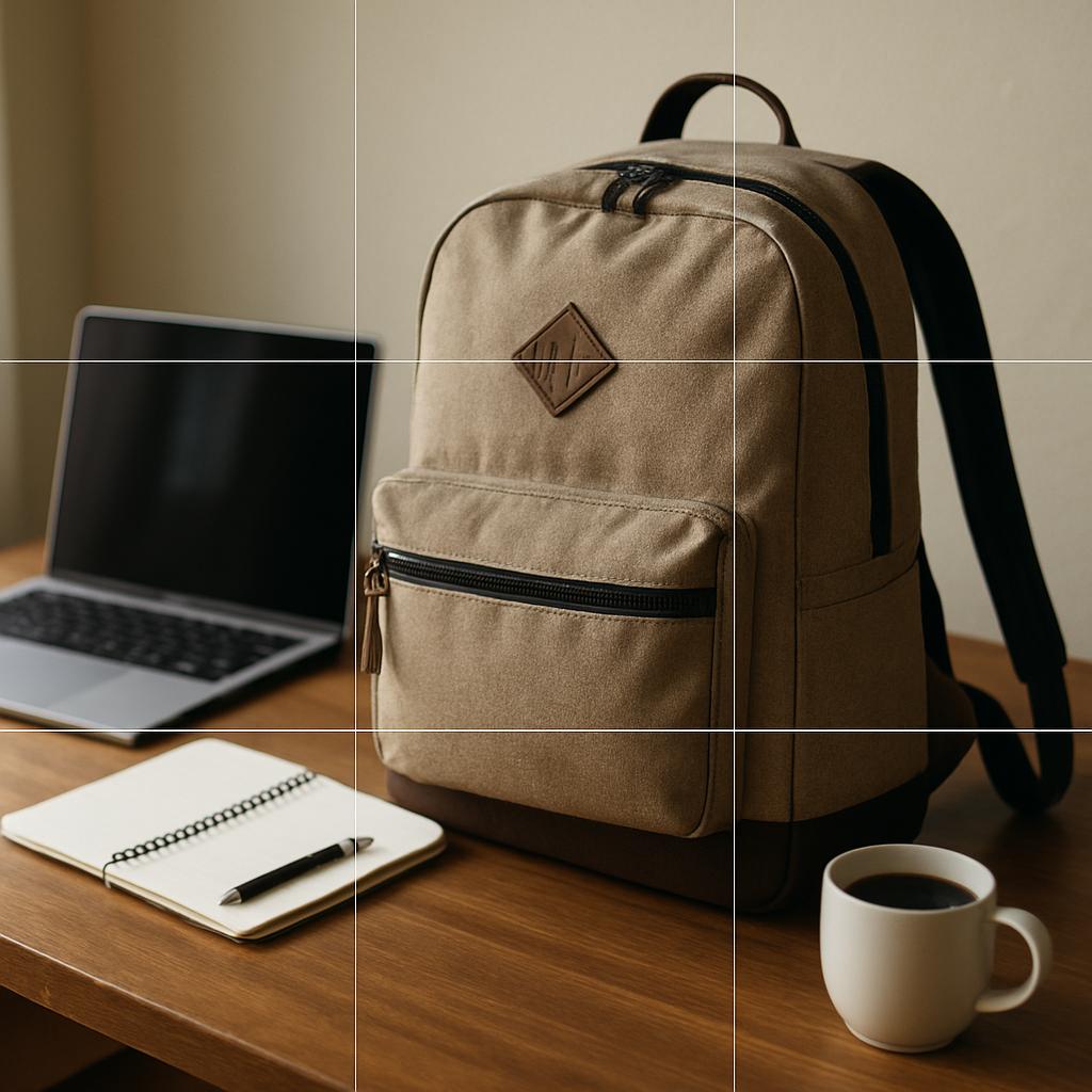
Use leading lines such as a counter edge or a table seam to point toward the object. Leave clean negative space for overlays or banners.
Crop with the end format in mind. Horizontal for site banners, square for product cards, and vertical for stories.
Layer Props Strategically
Props should serve the story. A skincare serum pairs with a towel, a mirror, and a plant. Too many extras distract.
Keep a simple ladder:
- Base surface that fits the brand.
- One hero prop that supports use.
- One or two textural accents for depth.
Match color temperature in-camera. A cool blue mug near a warm tungsten lamp can look off unless the palette calls for it.
Select Angles That Showcase Use
Angles communicate function.
A 45-degree three-quarter view is friendly and shows depth. Top-down clarifies layout for sets like coffee kits or tool bundles.
Shoot a sequence:
- Context wide shot to set the scene.
- Mid shot showing hands in use.
- Tight detail of textures, fasteners, or labels.
For wearables, show on-body scale. A watch on a wrist with a sleeve gives instant context that pure specs cannot. .
Action and Real-Life Interaction
Motion and small gestures make static products feel alive. You show how it works without over-explaining.
Show Natural Gestures
Hands reaching, pouring, zipping, or tapping a button read as natural. Ask models to perform a real task and hold for a beat at peak action.
Use a faster shutter speed to freeze small motions cleanly. For repeatable content, record short video clips alongside stills. You now have options for reels and PDP loops.
Get permissions. Model releases and property releases are important in commercial use. Keep forms in your production binder.
Include Small Actions With the Product
Small actions reveal key features.
Twist a lid, pull a strap, click a clip, or wipe a screen. Sequence three frames to explain the workflow.

Show cause and effect. The bottle sprays, the surface looks clean. The clasp opens, the inner pocket appears.
This approach increases comprehension in galleries.
Image Editing and Consistency
Edit to match reality and brand tone. Consistency means credibility, plus it shortens the path to purchase.
Adjust Color and Tone
Start with accurate color. Calibrate your monitor and use a color reference card for tricky materials. Neutral white balance keeps whites clean and skin tones healthy.
Work a simple order:
- White balance and exposure.
- Lens corrections and geometry.
- Global contrast and presence.
- Local brushes for labels or texture.
- Noise and sharpening last.
For workflows in Lightroom Classic, review Adobe’s guide to color management fundamentals.
Maintain Visual Consistency Across Photos
The same principles around brand consistency across channels apply to your photos.
Here’s how to do it:
- Create a style guide for cropping, contrast, saturation, shadows, and highlight rolloff.
- Save presets for your main lighting setups.
- Name files and versions in a way your future self will understand.
- Keep a master Photoshop document (PSD) or layered.
- Tagged image file format (TIFF) for each hero image.
- Document background hex codes and shadow depths.
Preparing Lifestyle Product Photography for Platforms
Adjust Photos for Social Media and E-Commerce
Each platform has its own technical needs. Export the right aspect ratio and size so your work looks as intended.
| Platform | Common Aspect Ratios | Recommended Size | Notes |
|---|---|---|---|
| Instagram Feed | 1:1, 4:5, 1.91:1 | 1080 px on the short side | Portrait 4:5 often earns more screen space. See Instagram’s note on photo aspect ratios. |
| Google Merchant Center | 1:1 or 4:3 | 1200 px minimum | Follow image requirements for clean shopping ads. |
| Shopify Store | Flexible | 2048 px longest side or higher | Shopify’s guidance on store images covers formats and compression. |
If you’re in e-commerce, this guide to social retailing tactics can help you plan content families that work together.
Test and Refine Based on Performance
Treat visuals like product copy. Create two or three variations of the hero image that change context, angle, or action.
Simple test plan:
- Split traffic on PDPs for one week per variant.
- Track gallery interactions, time on page, and add-to-cart.
- Review returns. Misleading images often correlate with higher returns.
On social, basic analysis is quite simple: track saves and profile visits from posts that feature in-use shots.
Summary
Lifestyle product photography has its own set of principles. It’s not just pointing the camera and shooting.
- Plan the story first, then pick the setting, props, and people to match.
- Use soft, directional light. Add artificial light when consistency or control is needed.
- Compose for clarity. Place the product as the hero and avoid busy backgrounds.
- Show small, believable actions that explain function and scale.
- Edit with restraint. Keep color accurate and tones consistent across the set.
- Export for each platform’s aspect ratio and file requirements.
- Test variations and refine your style guide over time.
- Keep your workflow simple so you can repeat it at scale.
| To go faster in production, try AI tool Stryng. It lets you generate, edit, and publish text and visuals in one place. With built-in image insertion, your online store can ship content without switching tools. Try it free. |
Frequently Asked Questions
Q: What is lifestyle product photography vs studio product shots?
A: Lifestyle shows the product in use and within a believable setting. Studio shots focus on the item alone against a clean background. You need both for ecommerce product photography because they answer different questions.
Q: Do I need models for every lifestyle shoot?
A: Not always. Hands-only or implied presence can be enough. For wearables or items that require fit, on-body photos help with scale and reduce returns.
Q: How do I choose props that do not distract?
A: Pick props that support function or context. Limit to one hero prop and one or two accents. Match textures and colors to the brand palette.
Q: What camera settings work best?
A: Use aperture priority with mid apertures for depth and sharpness. Keep ISO low for clean files. Lock white balance if the light does not change.
Q: What file format should I export?
A: JPEG for web delivery, PNG for transparency needs, and high-quality TIFF or PSD for master archives. Keep originals organized so you can re-export for new platforms.
Q: How does brand photography relate to lifestyle images?
A: Brand photography is the umbrella. Lifestyle images sit within that set and show values in action. They should match your typography, color system, and messaging so the experience feels cohesive.