Ecommerce content is the connective tissue between a shopper’s intent and a store’s revenue.
It turns a glance into a click, then a cart into a purchase.
Practical teams treat content as a product. They use data to decide what to write and where to place it.
The approach is simple (well, at least to explain): understand the product, understand the audience, choose the right format, and keep improving.
This guide presents proven tactics that marketers and merchandisers can use right now. It includes examples and procedures that fit real teams with limited time.
Types of Ecommerce Content
Ecommerce content covers every message that helps a person evaluate and buy.
It consists of, for example, product pages, reviews, category copy, visuals, help docs, and post‑purchase guidance.
A strong plan aligns all of that with search, UX, and conversion goals.
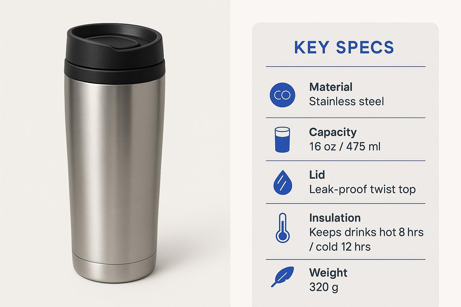
1. Product Descriptions
Product descriptions serve the shopper and the search engine. Shoppers need specifics and reassurance. Search engines need context and structured cues.
Good product copy answers five questions fast: what it is, who it is for, how it works, why it is better, and what to do next. It focuses on decision-critical details like materials, sizing, warranty, and compatibility.
To apply this, include scannable bullets near the fold and a fuller story lower on the page. Use language customers use in reviews and searches. That can support product page SEO without keyword stuffing.
Short and Long Descriptions
Short and long descriptions do different jobs. One helps people decide quickly. The other supports deeper research and can feed structured data.
| Description Type | Short | Long |
|---|---|---|
| Primary Goal | Fast clarity and action | Detailed evaluation and SEO context |
| Typical Length | 50–120 words + bullets | 150–300 words |
| Where It Lives | Above or near the fold | Lower on the page |
| What To Include | Key benefit, 3–5 specs, primary CTA | Materials, sizing guide, use cases, care, warranty |
When writing, add technical specs and identifiers where relevant. These details help eligibility for rich results through product structured data.
2. Visual Content
People buy what they can see and understand. Visuals carry most of the evaluation work, especially on mobile.
Detailed photography, short clips, and clean diagrams reduce doubt and drive faster choices.
You should plan visuals around what buyers struggle to imagine: scale, fit, texture, and use in context. Give them angles, zoom, and comparisons that answer those concerns in seconds.
Product Photography
Good photos do three things well: show true color, reveal important details, and communicate size.
Galleries should include a plain studio shot, lifestyle context, close‑ups, and a scale reference like a hand or a common object.
It’s important to use descriptive alt text for accessibility and for weak network conditions. The WebAIM guide on alternative text is a solid reference.
A useful pattern: start with a hero that shows the whole product, then follow with a sequence that answers typical objections. That sequence lowers hesitation and increases add‑to‑cart rates.
Videos and Infographics
Short videos can explain fit, assembly, or motion in ways photos cannot. Think 20–45 seconds with captions and on‑screen text.
Infographics work when specs or sizing tables are complex. They help shoppers understand technical details at a glance, making decisions easier.
People scan more than they read, and the F‑shaped reading pattern still shows up in session recordings. So, lead with the win, show the product in action, and end with a simple prompt to choose size or variant.
3. How-to Guides and Tutorials
Guides reduce pre‑purchase doubt and post‑purchase frustration. They also attract non‑branded search traffic that converts over time.
A cookware brand might publish “How to season a carbon steel pan.”
A fitness brand could create “Beginner 20‑minute kettlebell routine.”
It’s good to write guides that map to product categories. Each post should include a simple tools list, step timestamps, and links to relevant products.
Step-by-Step Instructions:
- State the goal in one sentence.
- List tools and materials.
- Show a preview of the finished result.
- Break the process into 5–7 steps with short verbs.
- Add 1–2 safety or care notes.
- Link to compatible products or parts.
- Offer a quick troubleshooting section for the most common mistake.
4. Lists and Collections
Collections help shoppers compare across a theme like price, use case, or season. These pages work well for search and email since they solve a single intent with multiple options.
In practice, use consistent comparison points such as size, warranty, or key material. Highlight “good, better, best” picks with plain labels so scanning is easy on mobile.
Themed Roundups
Roundups like “Gifts under $50 for runners” or “Cold‑weather bike gear essentials” drive discovery. They also move older inventory when you pair items with helpful notes.
To make this work, show how to choose the right option based on budget, size, or environment. Close with a short CTA that encourages adding two items that pair well.
5. User-Generated Content
UGC adds social proof and can answer questions faster than staff.
It’s important to tag content by variant when possible. That way, reviews for the “wide” fit or “tall” version appear for the correct shopper.
Customer Photos and Reviews

Photos shared by customers help buyers picture fit and color in real settings. Encourage uploads after delivery with a short incentive and a one‑click submission flow.
Mark up ratings and reviews according to guidelines to be eligible for rich results. Google’s documentation on Review snippet structured data explains limits and best practices.
Keep reviews specific with prompts like “How does the sizing compare to Brand X?” or “What job did you use it for?”
Testimonials
Testimonials work best when they name the problem, the product, and the outcome. Short quotes paired with a role or activity beat generic praise. Include a date and context to keep them credible.
Rotate testimonials based on category, not just the homepage. Shoppers should see a relevant quote within one scroll on a product detail page.
How to Write Ecommerce Content
Writing becomes easier when the process is repeatable.
Start with product truth, then add audience insight, then choose the right format. Finalize with a short QA.
Understand the Product
Writers need hands‑on context. If a sample is not available, schedule a product demo with the buyer or engineer. Ask how the product is different, what can go wrong, and what buyers misunderstand.
Collect the top five pre‑purchase questions from support. Those answers often become the best bullets on the page.
Key Features and Original Points:
- Materials and tolerances that matter in daily use
- Sizing and fit notes that reduce returns
- Compatibility with other products or brands
- Care instructions that protect the item
- Warranty or trial details that lower risk
- A single claim that sums up the benefit for the target user
Identify the Audience
A message written for skateboarders should not sound like lab gear. The same product can be framed differently for a first‑time buyer and a professional.
That’s why you should define the reading level, familiarity with the category, and typical objections. Then choose examples and terms that match that profile.
Customer Needs and Tone
- What they are trying to do today
- What might stop them from buying
- How they judge quality in this category
- Words they use to describe the problem
- Tone they expect: practical, playful, or expert
Choose the Format
Not every product needs a 300‑word story. Some need a tight spec table and three clear photos. Others benefit from a 45‑second clip showing the product in context.
Pick the format that answers the biggest doubts in the shortest time. Let the top customer questions guide the structure.
- Description: use bullets and specs for quick decisions
- Guide: teach a task that the product helps complete
- Visual: show motion, assembly, or scale that words cannot
- Comparison: position two or three close options side by side
| Thanks to AI tools like Stryng, you can create and publish product descriptions, guides, visuals and social content, all in one place. It can generate short or long copy with human-like quality and insert images where needed for product pages or posts. Try it for free. |
Write Clearly and Concisely
Short sentences serve busy shoppers. Plain language combined with active verbs lowers support tickets and maintains a pace.
Before publishing, improve flow and rhythm. Read the copy out loud. If a sentence trips the tongue, split it or choose simpler words.
Tips for Sentence Structure and Word Choice
- Lead with the benefit, then the feature
- Prefer concrete nouns over abstractions
- Replace adverbs with a stronger verb
- Cut filler like “very” or “really”
- Keep one idea per sentence
- Use numbers and ranges where helpful
Add Supporting Visuals
Words describe, visuals prove.
Pick the minimum set of visuals that resolve the biggest doubts. Then add captions that call out the one detail the viewer should notice.
- Photos: show texture, scale, and color in consistent light
- Diagrams: label components or sizing with simple icons
- Short clips: demonstrate how the product moves or fits
- Captions: highlight a spec or a care tip that matters most
- Accessibility: add concise alt text and avoid text baked into images
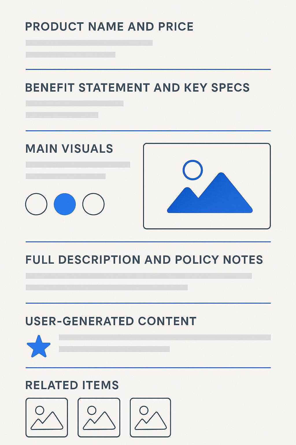
Structuring Content for Ecommerce
The goal of structuring content is to guide a shopper through a logical path: what it is, why it helps, what to choose, and how to buy.
Clear hierarchy and consistent patterns also help search engines parse the page for product page SEO signals.
Hierarchy of a Product Page
A typical product page stacks information in a strict order.
First comes the product name and price.
Next, a short benefit statement and key specs.
Visuals sit near the top, with variant selectors visible without scrolling on desktop and mobile.
Below the fold: the full description, details, and policy notes. Then UGC and related items.
The shape stays consistent so customers know where to look each time.
Headline, Key Features, and Visuals
Consider these pro tips:
- Headline: prefer a clear name plus the defining spec or use case
- Features: 3–5 bullets that answer sizing, fit, or main benefit
- Visuals: gallery, short clip, and in‑use photo within one scroll
- CTA: single primary action with a secondary save or wishlist
- Microcopy: shipping, returns, and warranty near the CTA for reassurance
Formatting for Readability
Formatting means using clear subheads, short paragraphs, and bullets or tables only when they help readers compare information
Bullets, Tables, and Captions
Use formatting as a tool, not decoration. Choose the right element:
| Element | Best Use | Why It Works |
|---|---|---|
| Bullets | Specs, benefits, inclusions | Scannable chunks lower the mental effort |
| Tables | Comparisons, size charts | Side‑by‑side details aid decision speed |
| Captions | Callouts on visuals | Direct attention to one proof point |
Favor consistency so pages feel familiar. Stick with one table style and one bullet rhythm across the catalog.
Repurposing Content
Great content should work more than once.
A 300‑word description can become a 30‑second clip, three social posts, and an email segment. Category guides can turn into seasonal gift pages. A how‑to guide might become a carousel or a printable checklist.
How to do it? You can find useful ideas and inspiration in this review on adapting long‑form content for social media.
Final Thoughts
Effective ecommerce content explains, shows, and guides.
It explains what the product is, shows fit, scale, and context through visuals, and guides the shopper with scannable copy.
Descriptions, guides, and lists help buyers compare options, while collections and themed roundups highlight relevant choices.
Customer photos and reviews answer questions faster than text alone and give confidence in decisions.
Consistent structure, simple language, and well-chosen visuals make pages easier to scan and understand.
When every element is in its place, shoppers decide and act faster..
Frequently Asked Questions
Q1: How long should a product description be for SEO and conversions?
A short description near the top should be around 50–120 words with 3–5 bullets. A longer section of 150–300 words can sit lower on the page. This split supports quick decisions and adds context for search.
Q2: What makes product page SEO different from blog SEO?
Product pages rely more on structured data, concise specs, and variant logic. Blogs lean on topic depth and internal linking. Both benefit from clear headings, alt text, and natural language that reflects customer queries.
Q3: How do videos affect conversion rate optimization?
Short clips answer questions that photos cannot. They reduce doubt about motion, scale, or assembly, which helps conversion. Keep videos under a minute, add captions, and place them near the top of the product page.
Q4: Should every product page have user reviews?
Reviews help most categories. They add social proof and surface fit notes. Hide spam, encourage specific feedback, and prompt for details like use case or sizing to improve quality.
Q5: When is content automation helpful and when should humans write?
Automate repetitive elements like spec tables or size charts that pull from a database. Humans should write benefit statements, microcopy, and troubleshooting notes. But some AI tools produce very human-like content.